🎨 AI Design · Color Palettes · Brand Identity
AI Color Palette Generator Tools
2026 Comparison Guide
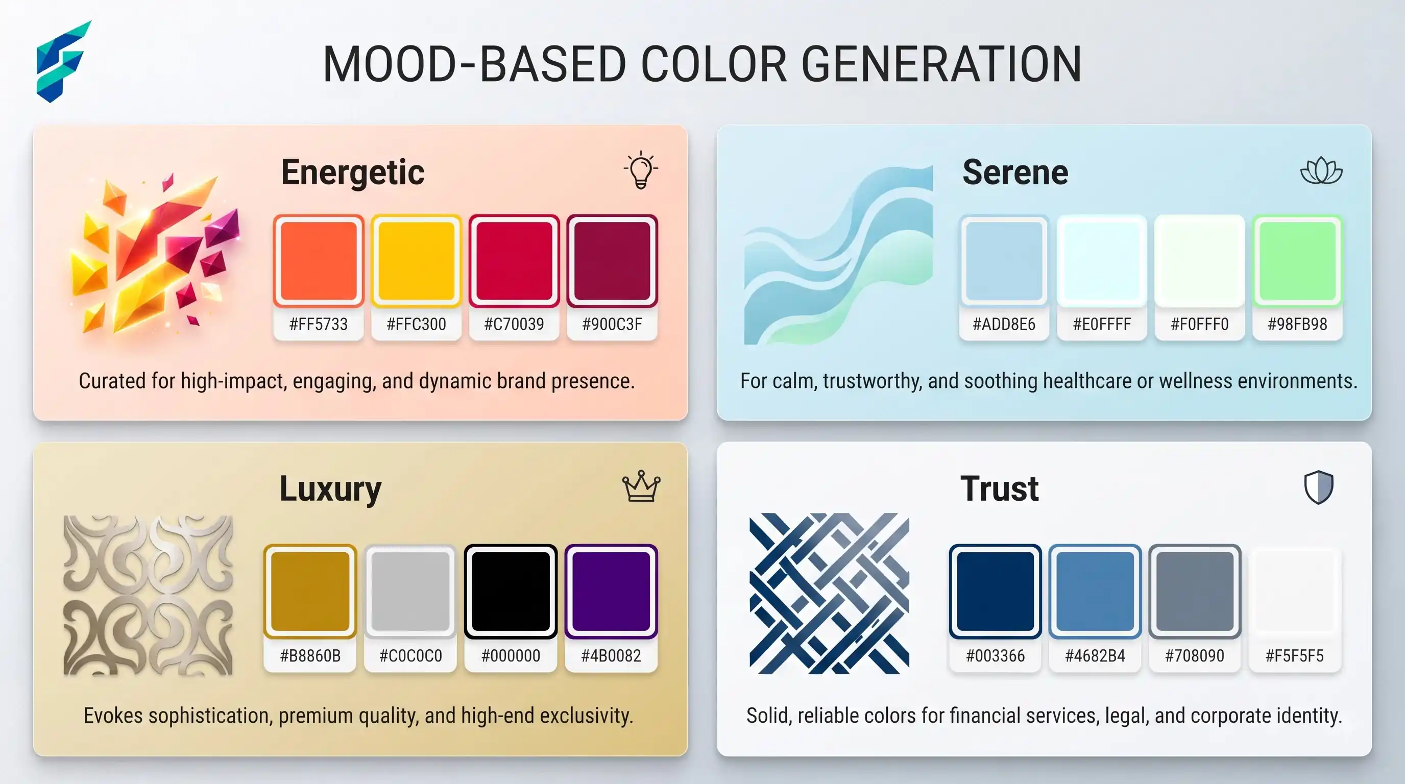
The pitch for these tools is always the same: describe a mood or upload an image, get a five-color palette back in seconds. That part's true. The part that gets glossed over is that a palette which looks great as five swatches in a row can fail badly the moment it's applied to actual buttons, text, and backgrounds — a real risk worth checking before you build a whole site around it.
Quick answer: AI color palette generators work well when you already have an anchor — a brand font, a logo, a reference image — and you're using the tool to build out from it, then you test the result for contrast and accessibility before shipping. They work poorly when you generate a palette in isolation, pick the prettiest one, and never check how it performs with real text sitting on top of it.
What these tools actually need from you
A generator is only as good as the anchor you give it. Feed it nothing and it hands back a generic "safe" palette — usually a muted blue-and-gray set, technically inoffensive, forgettable. Give it your logo, a competitor you admire, or a specific mood ("energetic but not childish"), and you get something that reads like it was chosen for your brand specifically, not pulled off a swatch library.
For example, when I fed a tool a reference image of a "warm, earthy coffee shop interior" and anchored it with a specific hex code for a deep espresso brown, it generated a palette featuring a soft oat milk beige, a terracotta accent, and a muted sage green. It felt intentional and branded, not like a random splash of colors.
The identical-feel problem
Run every page of your site through the same generator with the same default settings and you'll notice it eventually: every section uses the same five colors in the same proportions, nothing distinguishing a hero banner from a footer. Visitors browsing multiple pages pick up on this even when they can't say exactly why the site feels flat.
Fix: don't treat a color palette as a one-time decision made in isolation. Check it against your actual logo and your font pairing before you finalize it — a palette that looks resolved on its own can clash the moment it sits behind a wordmark or under a typeface it wasn't tested with.
Where accuracy actually matters
A palette generator can hand you five colors that look harmonious in a swatch strip and then fail on your actual site — text that doesn't meet contrast minimums against its background, a "highlight" color that's indistinguishable from the base color to colorblind users, or a palette that looks fine on a monitor and washes out on mobile in direct sunlight. Especially for anything customer-facing (buttons, form labels, error states), always run the palette through a contrast checker before publishing, not just eyeballing the swatch preview.
I once generated a beautiful pastel palette for a SaaS dashboard. The "highlight" color looked great next to the primary blue in the swatch tool, but when applied to small form error text, it completely failed WCAG AA contrast standards. If I hadn't run it through a contrast checker, we would have shipped an inaccessible UI.
SEO and performance considerations specific to this use case
Color choice affects more than looks — low-contrast text is flagged by accessibility audits that increasingly factor into page experience and SEO scoring, and a palette that forces you to lighten text to "make it look softer" can quietly push you below readability thresholds search engines and screen readers both care about. This is another reason a tested palette matters more than a pretty one: it's not just about how the site looks, it affects who can actually read it.
Where these tools genuinely save meaningful time
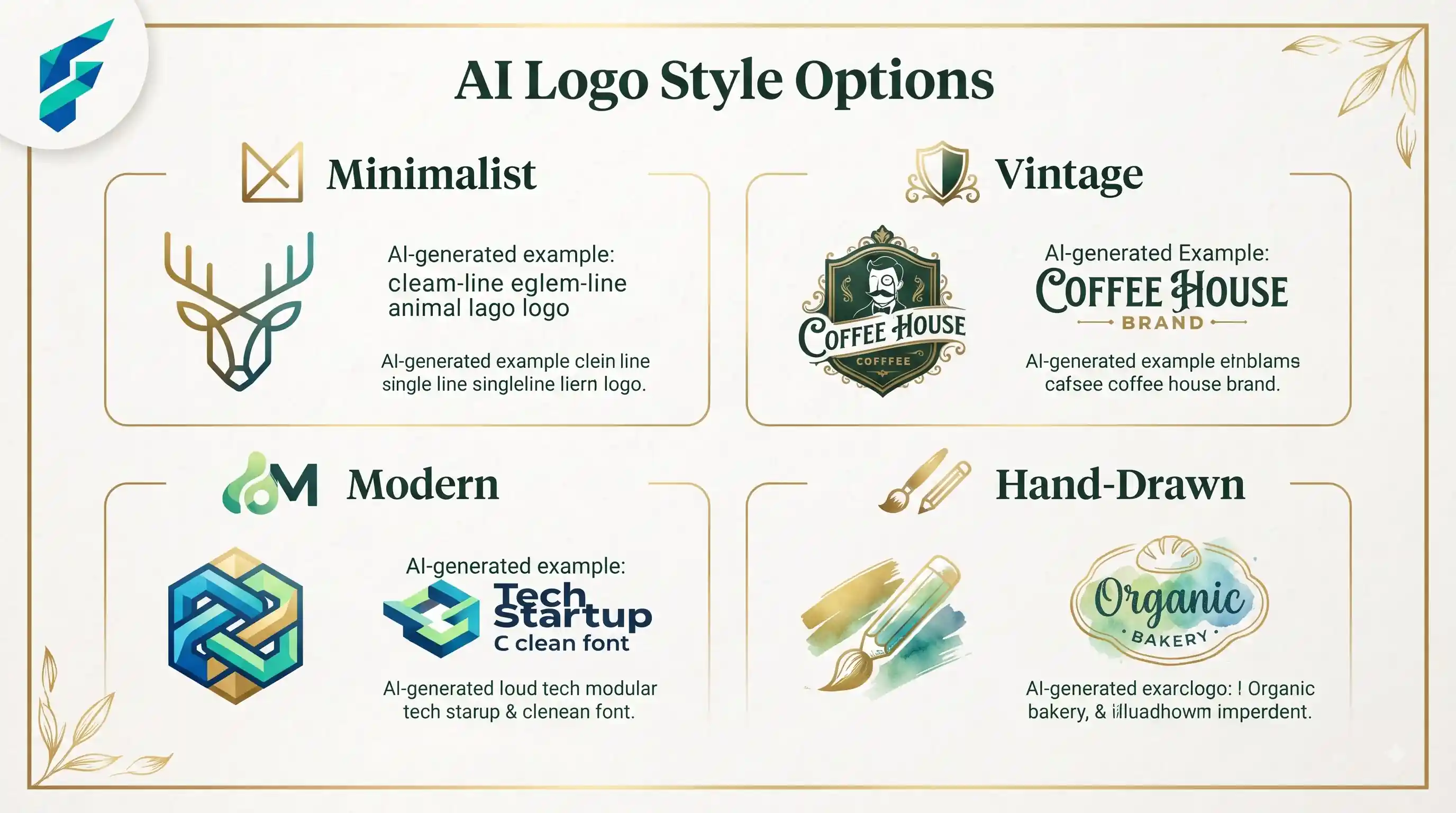
Sites and brand systems that need a full palette fast — a landing page, a one-off campaign, a client mockup — benefit most, since there's no existing color system to conflict with. If you're building a brand from scratch rather than patching an existing site, it's worth working through your full brand identity design process first, so the palette is solving a problem you've actually defined instead of guessing at one. And if your logo itself isn't locked yet, it's worth running it through a logo generator before you build a palette around colors that might change.
Comparing your options
| Approach | Best for | Typical cost | Risk of catalog-wide sameness | Accessibility risk |
|---|---|---|---|---|
| Image-to-palette extractor | Matching an existing photo, logo, or reference | Free | Low individually, high if reused across every page | Moderate — no built-in contrast checking |
| Manual palette builder (Coolors-style) | Full control, fast iteration, exporting variations | Free–low cost | Low, if you vary by section | Lower — most include a contrast/lock feature |
| AI mood-to-palette generator | Fast starting point from a text description | Free–low cost | Moderate if defaults go unchanged | Moderate — check against WCAG separately |
The one habit that prevents most problems
Run a chosen palette through a contrast checker with your real text sizes, not just the tool's swatch preview, which almost always shows colors under ideal conditions with no text on top. A quick check across a real page — buttons, body copy, error states — catches accessibility failures a clean swatch strip never will.
My workflow: generate three palettes based on a specific mood keyword, drop the winner into a Figma mockup of the actual homepage, and run it through a WCAG contrast checker for both normal and large text. If it passes, it goes into production. If you need help finding the right generator to start this process, check our Tool Finder filtered for design and branding tools.