🔤 AI Design · Typography · Brand Identity
AI Font Pairing Tools
Which Ones Are Worth Your Time in 2026?
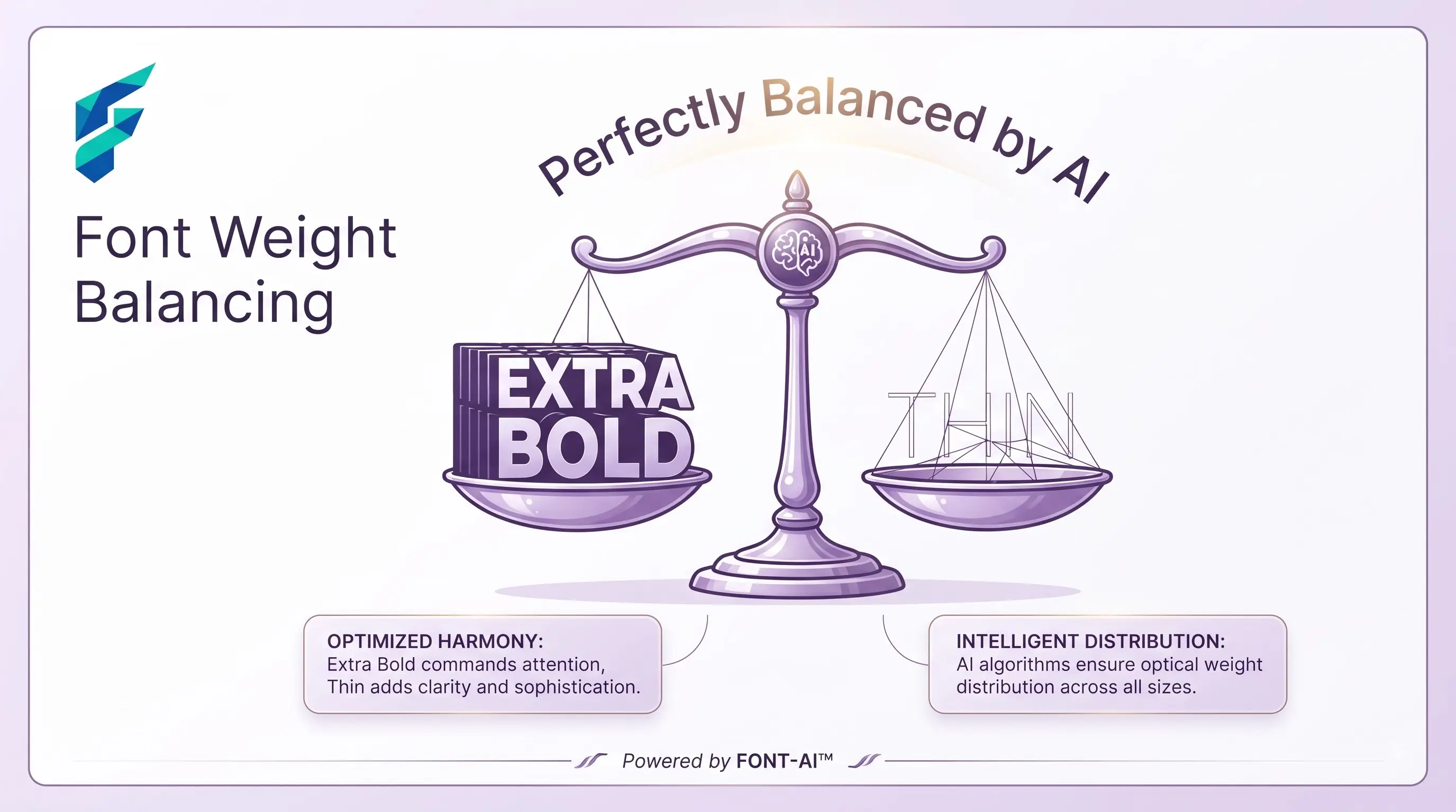
The pitch for these tools is always the same: type in one font, get a matching one back in seconds. That part's true. The part that gets glossed over is that a pairing which looks great as two words on a white background can fall apart the second it's dropped into a real layout with buttons, long paragraphs, and a busy background behind it — a real risk worth checking before you lock a pairing into your whole site.
Quick answer: AI font pairing tools work well when you already know your brand's mood and just need options that match it, then you test the result inside an actual layout before committing. They work poorly when you generate a pairing in isolation and never check it against your logo, your colors, or a page with real content on it.
What these tools actually need from you
A generator is only as good as the anchor you give it. Feed it nothing and it hands back a generic "safe" combination — usually a geometric sans with a humanist serif, technically fine, forgettable. Give it your actual heading font, or describe the mood you're going for, and you get something that reads like it was chosen for your brand specifically, not pulled off a template shelf.
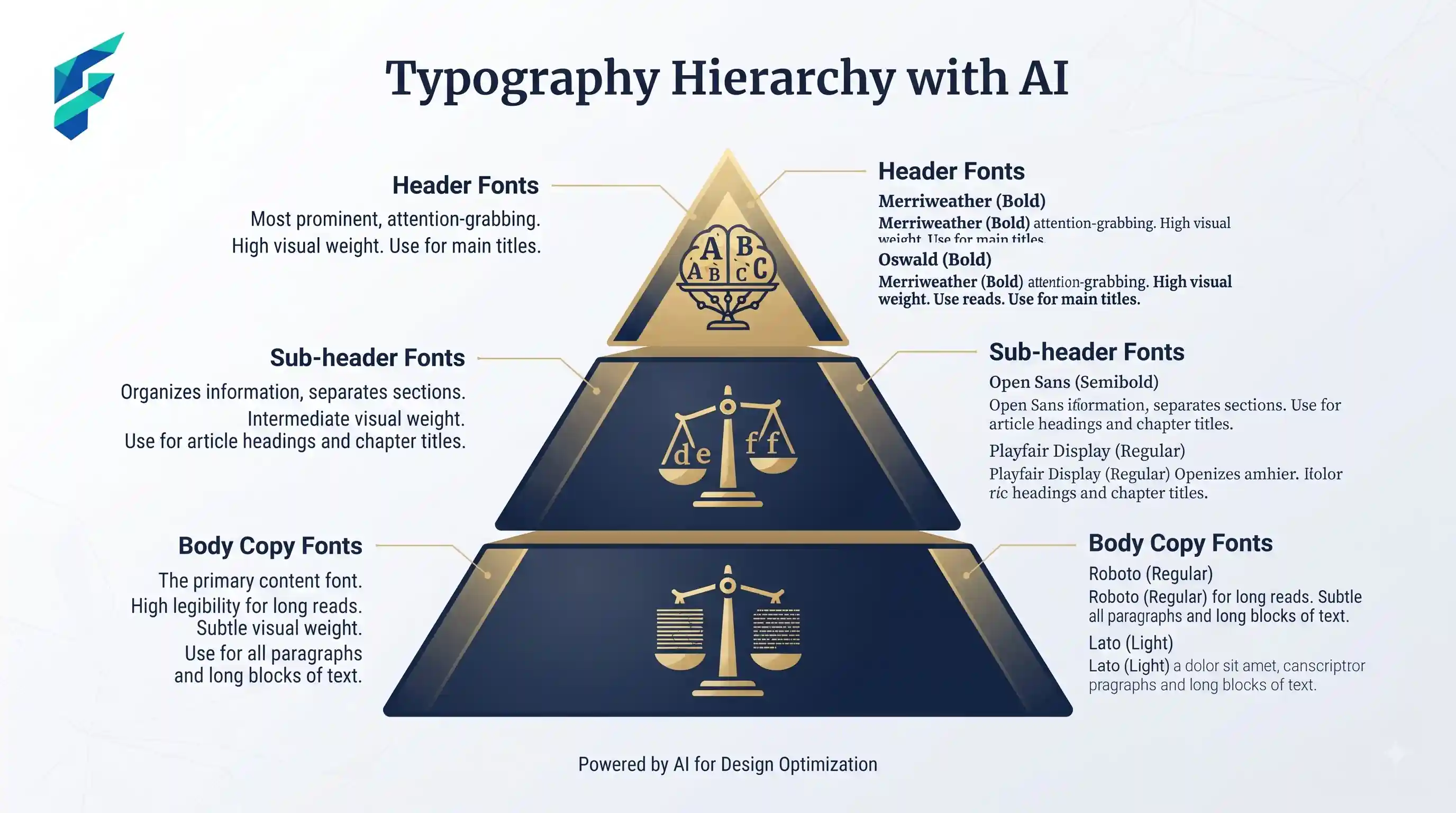
For example, when I fed a tool the constraint "a trustworthy, tech-forward SaaS with a slight retro edge" and anchored it with 'Space Grotesk' for headings, it suggested 'Inter' for body copy. The tool correctly identified that Inter's tall x-height balances Space Grotesk's quirky geometric details without competing with them.
The identical-feel problem
Run every page of your site through the same pairing tool with the same default settings and you'll notice it eventually: every heading and body combination on the site reads with the same rhythm, the same weight ratio, nothing distinguishing one page from another. Visitors browsing multiple pages pick up on this even when they can't say exactly why the site feels flat.
Fix: don't treat font pairing as a one-time decision made in isolation. Check the pairing against your actual logo and your AI-generated color palette before you finalize it — a combination that looks resolved on its own can clash the moment it sits next to a wordmark or a background color it wasn't tested with.
Where accuracy actually matters
A pairing tool can hand you two fonts that look harmonious in the preview and then fail on your actual site — poor readability at small sizes, a body font that isn't hinted well for screens, or a heading font that's missing the weight you need for mobile. Especially for anything customer-facing (checkout pages, forms, long-form content), always test the pairing at real sizes on a real device before publishing, not just in the tool's sample text box.
I once approved a pairing where the body font looked elegant in the preview but lacked proper screen hinting. On a real mobile device, the 14px text blurred into a fuzzy gray block. If I hadn't tested it in a live browser, our checkout page would have suffered a massive drop in completion rates.
SEO and performance considerations specific to this use case
Font choice affects more than looks — every additional font family is another file the browser has to load before text renders, and slow-loading type shows up as layout shift, which search engines factor into page experience scoring. This is another reason a tested pairing matters more than a pretty one: it's not just about how the site looks, it affects how fast it feels.
Where these tools genuinely save meaningful time
Sites and brand systems that need a heading/body pairing fast — a landing page, a one-off campaign, a client mockup — benefit most, since there's no existing type system to conflict with. If you're building a brand from scratch rather than patching an existing site, it's worth working through your full brand identity design process first, so the pairing is solving a problem you've actually defined instead of guessing at one. And if your logo itself isn't locked yet, it's worth running it through a logo generator before you finalize any type system around it.
Comparing your options
| Approach | Best for | Typical cost | Risk of catalog-wide sameness | Readability risk |
|---|---|---|---|---|
| Quick random generator (Fontjoy-style) | Fast decisions, personal projects, breaking creative block | Free | Low individually, high if reused across every page | Moderate — no built-in size/device testing |
| AI pairing agent with rationale (chat-based) | Understanding why a pairing works before committing | Free–low cost | Low, if prompts vary by page | Lower — often includes readability notes |
| Built-in web-safe suggestions (Google Fonts) | Budget-conscious projects, guaranteed free licensing | Free | Moderate if defaults go unchanged | Lower — optimized for screen rendering |
The one habit that prevents most problems
Test a chosen pairing inside your actual layout, next to your logo and your real color palette — not just in the pairing tool's sample text box, which almost always shows the fonts under ideal conditions. A quick check across a real page with a color palette generator open beside it catches clashes and readability issues a clean preview never will.
My workflow: generate three options based on a specific mood keyword, drop the winner into a Figma mockup of the actual homepage next to the logo, and check it in dark mode. If it survives that, it goes into production. If you need help finding the right generator to start this process, check our Tool Finder filtered for typography and design tools.