📱 AI Design · App Icons · UI/UX
AI Tools for App Icon Design
2026 Comparison Guide
The pitch for these tools is always the same: describe your app, get a polished icon back in seconds. That part's true. The part that gets glossed over is that an icon which looks sharp at 512px in a preview can turn into a muddy blob the moment it's sitting at 40px on an actual home screen next to thirty other icons — a real risk worth checking before you submit anything to an app store.
Quick answer: AI app icon tools work well when you already know the one shape or symbol your app should be recognized by, and you use the tool to refine that idea across sizes and platforms. They work poorly when you generate an icon in isolation, pick the prettiest full-size version, and never test it shrunk down next to your actual competitors' icons.
What these tools actually need from you
A generator is only as good as the concept you give it. Feed it just an app name and category, and you get a generic result — usually a gradient blob with a vaguely relevant symbol in the middle, technically fine, forgettable. Give it a single concrete idea (a specific object, a simplified version of your logo mark, a distinctive shape), and you get something that reads like it was designed to be recognized, not generated to fill a square.
For example, when I prompted a tool with "a minimalist, flat-design icon of a stylized fox head using only two colors: deep orange and charcoal gray," it generated a crisp, recognizable mark instead of the usual generic gradient globe or abstract letter "A" that most finance apps default to.
The blends-in problem
Generate icons through the same tool with the same style presets and you'll notice it: rounded gradient squares with a simple white glyph in the center, the same composition every app in the category seems to land on. Users scanning a crowded home screen or app store search results pick up on this even if they can't articulate why nothing stands out.
Fix: don't finalize an icon in isolation. Check it against your actual UI/UX design system so the icon's shape and color language actually match what's inside the app, and compare it side by side with your website's design so a user recognizes the brand whether they're looking at the app icon or the landing page.
Where accuracy actually matters
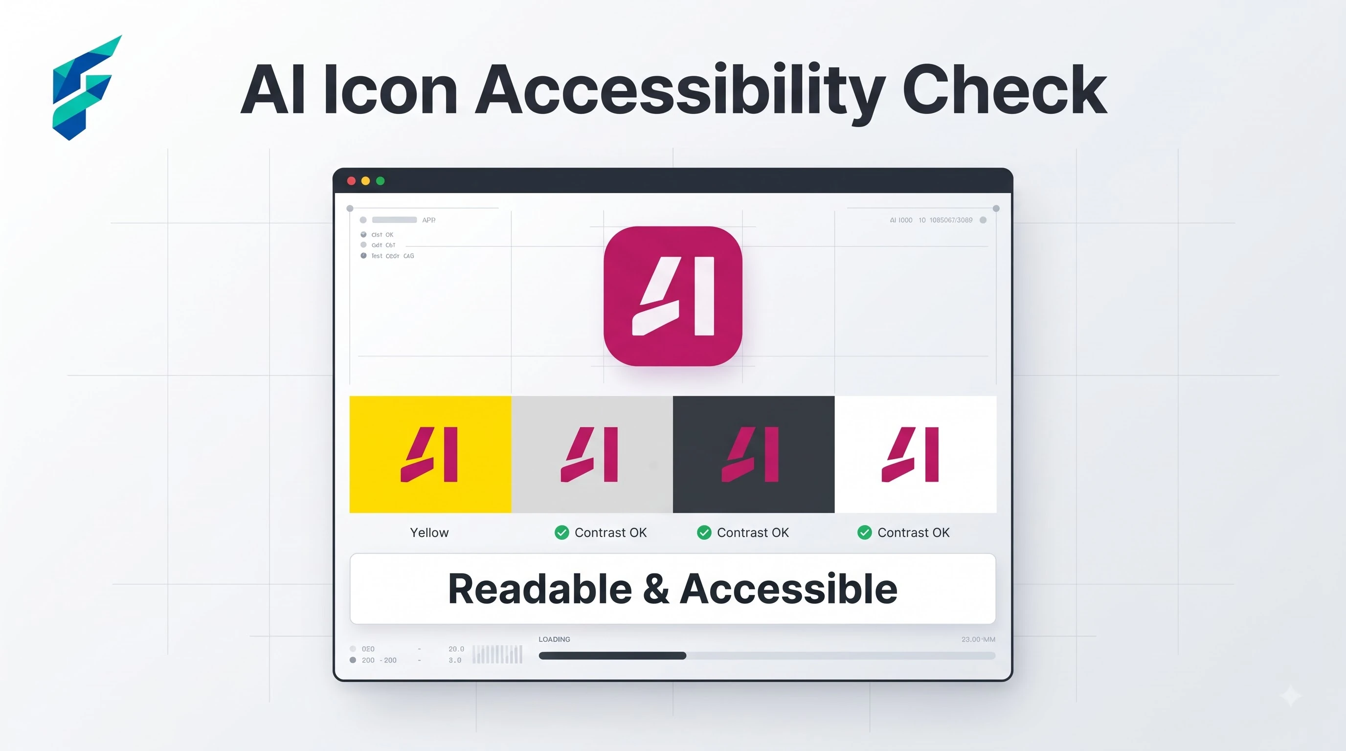
A generated icon can look great at full resolution and then fail specifically at small sizes — fine details that disappear, text that becomes an illegible smear, a color combination that loses contrast against both light and dark system backgrounds. Especially before an app store submission, always preview the icon at actual device sizes (and against both light and dark home screens) before locking it in, not just at the large export size the tool shows you by default.
I once generated an icon with intricate line work that looked fantastic at 512px. But when I shrunk it to 40px for the iOS home screen, the lines merged into a gray smudge. If I hadn't tested it at actual size, we would have shipped an illegible icon that users couldn't find on their phones.
Platform considerations specific to this use case
App icons aren't just artwork — each platform has its own shape mask, corner radius, and safe-zone rules, and an icon designed without those in mind can get cropped or padded awkwardly by the store itself. This is another reason a tested icon matters more than a pretty one: a shape that looks intentional in a square canvas can look accidentally cut off once the platform applies its own mask on top of it.
Where these tools genuinely save meaningful time
Small teams building a first version of an app — where there's no existing icon to conflict with and speed matters more than an exhaustive design process — benefit the most, since generating a dozen directions and narrowing them is much faster than briefing a designer from scratch. If you're a non-designer building the rest of your product's tooling at the same time, it's worth pairing this with an AI coding assistant built for small teams so the icon isn't the only piece being generated without a design background behind it.
Comparing your options
| Approach | Best for | Typical cost | Risk of blending in | Small-size legibility risk |
|---|---|---|---|---|
| Prompt-based icon generator | Fast first drafts, exploring several directions at once | Free–low cost | High if used with default style presets | Moderate — always test shrunk down |
| Vector/logo tool adapted for icon use | Turning an existing logo mark into a proper icon set | Free–low cost | Low, since it's based on your own mark | Lower, if the mark was simple to begin with |
| Dedicated app icon generator (with platform export presets) | Teams needing correct sizes/masks for iOS and Android at once | $0-30/mo | Moderate — depends on the style you choose | Lower — built-in size previews catch most issues |
The one habit that prevents most problems
Shrink your final icon down to actual home-screen size and place it next to five real competitor icons before you ship it — not just the large preview the tool exports by default, which almost always looks better than the app will at real size. A quick side-by-side at true scale catches the blends-in and illegibility problems a clean full-size render never will.
My workflow: generate a batch of icons based on a single, strong core concept, export them at 40px, 60px, and 120px, and place them on a mock home screen next to Apple and Google's default apps. If it holds its own visually, it's ready. If you need help finding the right generator to start this process, check our Tool Finder filtered for design and branding tools.