🎨 AI Design · UI/UX · Product Design
AI Tools for UI/UX Design
(For Small Teams Without a Designer)
If you're building a product or app without a dedicated designer on the team, AI tools have made it genuinely possible to get to a usable, reasonably good interface on your own. "Reasonably good" is an honest ceiling, though — there's a real difference between an interface that works and one that's been through actual user-testing and refinement, and AI alone doesn't close that gap.
Where AI genuinely helps a non-designer
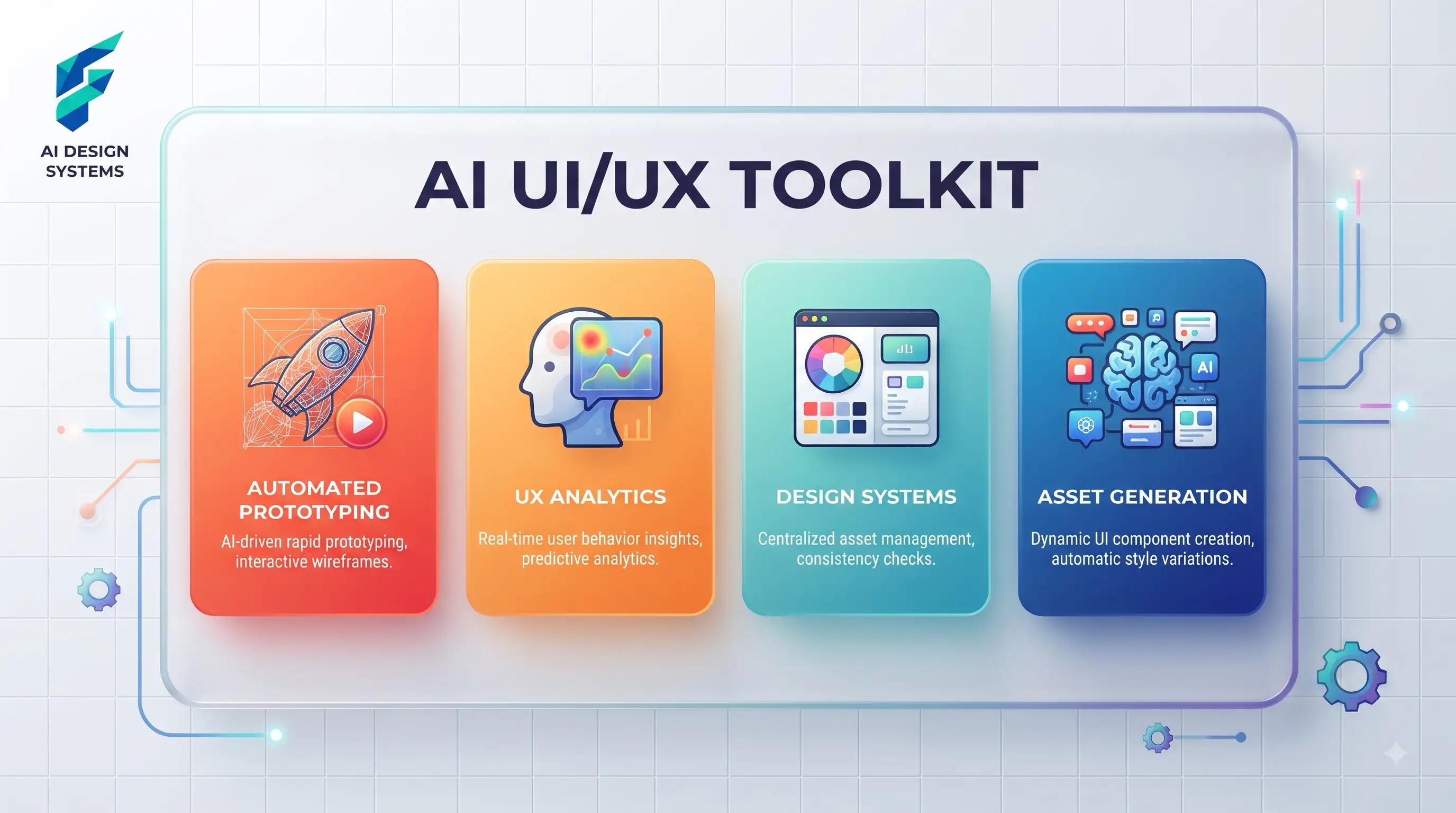
- Generating layout options fast. Describe a screen's purpose and AI-assisted design tools can generate several layout directions to react to, which is often easier than starting from a blank canvas trying to invent a layout from scratch.
- Maintaining visual consistency. Once you've picked a style direction, AI tools can help keep spacing, color use, and component styling consistent across many screens — a genuinely tedious manual task that's easy to get sloppy on without a system.
- Generating supporting assets. Icons, illustrations, and small decorative elements that match your interface's style, rather than hunting through generic icon libraries for something close enough.
When building our tool finder dashboard, I used an AI layout generator to quickly mock up the filtering sidebar and results grid. It saved me about 3 hours of wrestling with Figma auto-layout constraints just to get a baseline structure to iterate on.
Where it falls short of real UX work
- Understanding actual user behavior. Good UX comes from watching real people struggle with a real interface and iterating based on what you observe. AI can suggest a plausible, pattern-based layout — it has no way to know how your specific users will actually behave with it until you test it with them.
- Accessibility beyond the basics. AI-generated interfaces often handle baseline accessibility reasonably (contrast, basic structure) but miss the deeper considerations — screen reader flow, keyboard navigation logic, edge cases for users with different needs — that come from deliberate accessibility review, not generation alone.
- A genuinely novel interaction pattern. If your product does something interface design hasn't really solved before, AI tools will default to familiar, existing patterns, because that's what they've learned from. Genuinely original interaction design still needs human creative problem-solving.
We once had an AI-generated onboarding flow that looked perfectly logical on paper. However, user testing revealed that non-technical users were completely confused by the "API Key" step, which the AI had placed prominently. We moved it to an "Advanced" dropdown, a nuance no AI layout generator would have suggested based purely on visual patterns.
Where this fits for a specific product need
If you're designing an app icon specifically, that's a narrower, related design problem worth its own consideration — our guide to AI tools for app icon design covers that in more depth. For the broader small business design landscape beyond app and product interfaces, our overview of AI design tools covers where UI/UX work fits relative to marketing and brand design more generally.
Where AI tools can accidentally mislead you
One subtle risk worth naming: an AI-generated interface can look polished enough to feel finished before it's actually been validated with real users. The visual confidence of a generated design — clean spacing, a cohesive color system, professional-looking typography — can create a false sense that the underlying flow and logic are equally solid, when those are two separate things a polished look doesn't guarantee.
Treat visual polish and functional soundness as separate checks, and don't let a good-looking generated screen talk you out of actually testing whether people can use it the way you intended. I once shipped a beautifully minimalist checkout form generated with AI assistance. It looked incredibly sleek, but user sessions showed a 40% drop-off because the "Next" button's subtle styling made it look disabled. Visual polish had masked a fundamental usability flaw.
A realistic workflow for a small team
Use AI to get to a workable first version fast, then get the interface in front of a handful of real potential users as early as you can — even five people trying it will surface issues an AI-generated draft can't anticipate on its own. Iterate from real feedback, not from generating more AI variations of a design nobody's actually used yet.
My current process is to get a functional Figma prototype in front of 3-5 target users within 48 hours of the first AI-assisted draft. I watch them try to complete a core task without guiding them, and I only iterate on the design based on the friction points they actually encounter, rather than endlessly tweaking colors in a vacuum.
External resources
- Figma — widely used for UI design work, with a range of AI-assisted plugins and features layered into a flexible, collaborative design tool.