📊 AI Design · Data Visualization · Content Marketing
AI Tools for Infographic Creation
(Turning Data Into Something People Read)
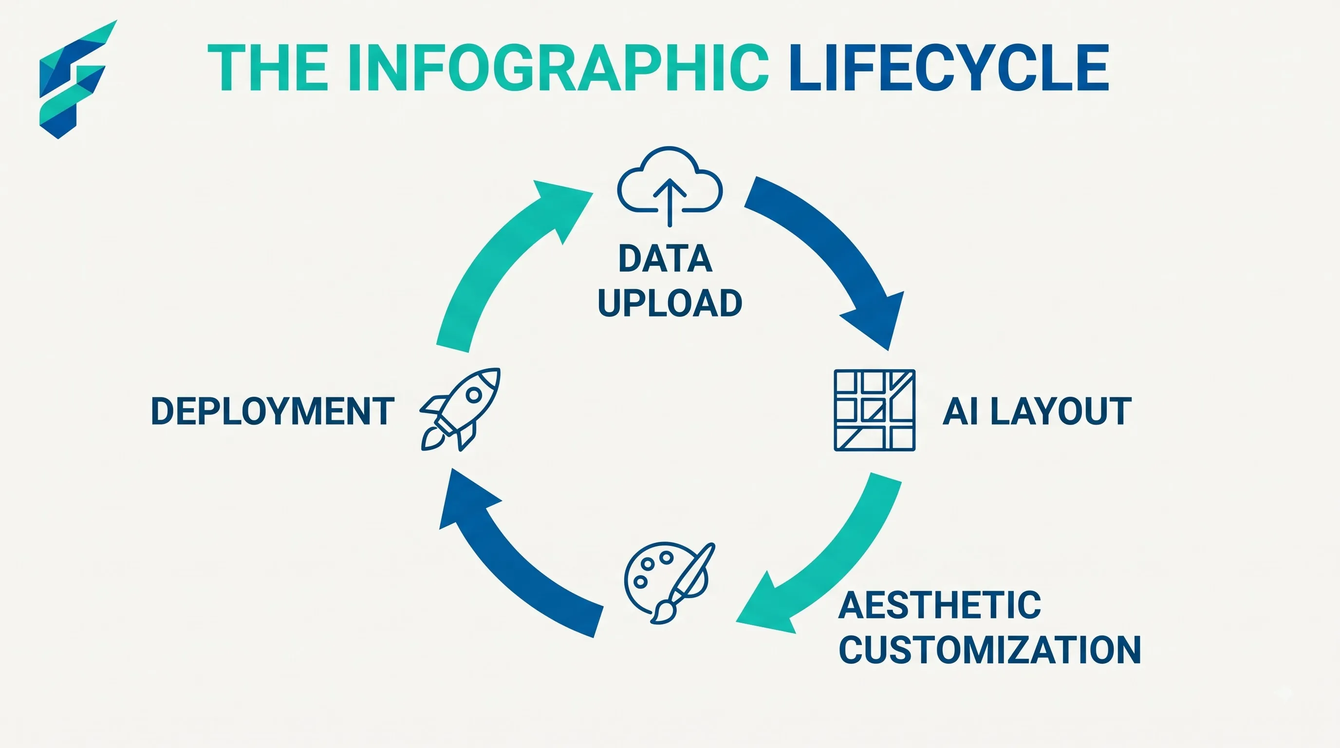
An infographic's entire value proposition is that someone will look at it who wouldn't have read the underlying report or article. That only works if the design does real work — organizing information visually so it's faster to absorb, not just prettier to look at. A busy, cluttered infographic fails at the one thing infographics are supposed to be good for.
The psychology of visual restructuring
The human brain processes visual information significantly faster than blocks of text. When you hand a reader a 2,000-word report, their cognitive load spikes immediately. An effective infographic acts as a cognitive offload, translating dense paragraphs into scannable visual chunks. AI accelerates this by instantly mapping relationships between data points that might take a human designer hours to conceptualize, turning a "wall of text" into a "path of least resistance" for the reader's eyes.
What AI actually handles well in this process
- Turning raw data into a visual structure. Feed a spreadsheet or a set of stats into an AI-assisted design tool and it can suggest chart types, groupings, and a visual hierarchy — which numbers deserve to be big and central, which are supporting detail — faster than staring at a spreadsheet trying to figure out the story yourself.
- Drafting the narrative flow. Good infographics tell a story, usually top to bottom or left to right. AI can help draft that sequence from a pile of bullet points or a long article, suggesting what goes first, what builds on what, and where a reader's eye should naturally land next.
- Generating icon sets and visual consistency. Rather than hunting through icon libraries for a matching style, AI-assisted tools can generate or suggest a cohesive icon set so your infographic doesn't look like it was stitched together from five different design kits.
For example, we recently turned a dense 15-point checklist on "AI Automation Costs" into a single, vertical flowchart. The AI tool suggested grouping the costs into "Initial Setup", "Monthly Subscriptions", and "Hidden Scaling Fees", which instantly made the financial breakdown 10x more digestible for our readers.
Matching the tool to your data type
Choosing the right AI tool depends heavily on what you're trying to visualize. If your source material is primarily statistical (e.g., survey results, revenue growth), you need an AI tool with strong native data visualization capabilities, like automated chart generation and dynamic scaling. However, if your source is a process or timeline (e.g., "5 Steps to Onboard a New Client"), you need an AI that excels at spatial layout and iconography, rather than complex graphing. Knowing this distinction before you open the tool saves you from fighting a square peg into a round hole.
Where this connects to your existing content
The best infographics usually come from content you already have — a blog post, a data set you've analyzed, a report you've written — reformatted for a different kind of reader. If infographic creation is part of a bigger content plan, it's worth reading this alongside our piece on AI tools for small business content strategy, since deciding what's worth turning into an infographic is a strategy question before it's a design one.
If the infographic is based on your own business data — sales trends, customer patterns, survey results — our guide to AI data analysis tools covers the step before this one: making sense of the raw numbers before you try to visualize them.
Where AI gets infographics wrong
- Cramming in too much. AI-assisted tools will happily fit more data points onto a page than a reader can actually process. More information isn't automatically better here — the whole point of an infographic is selective emphasis, and that's still a judgment call only you can make about what actually matters most.
- Misrepresenting data through poor chart choices. A chart type that technically displays the numbers but visually exaggerates or understates a trend (a truncated axis, an inappropriate chart type for the data) is a real risk when generating visuals fast. Always sanity-check that the visual representation is honest, not just eye-catching.
I once had an AI tool generate a bar chart comparing two metrics where the Y-axis didn't start at zero. While the underlying numbers were correct, the visual difference between the bars looked massive, exaggerating a minor 5% variance into what looked like a 50% gap. Catching that required a manual review of the axis settings before publishing.
Accessibility must be baked in, not bolted on
Accessibility is a critical final step that AI generators routinely ignore. AI tools often prioritize aesthetic contrast over WCAG compliance, resulting in light gray text on white backgrounds or color palettes that are indistinguishable to colorblind users. Always run your final AI-generated infographic through a contrast checker. Furthermore, because infographics are typically exported as images (PNG/JPG), you must manually provide a comprehensive text alternative (alt text or a hidden HTML summary) so screen reader users aren't locked out of the insights you worked hard to visualize.
A workflow that actually produces something people read
Start with the one key takeaway you want someone to walk away with — not five, one. Build the entire visual hierarchy around making that one point unmissable, and let supporting details stay genuinely secondary. This is a stricter discipline than most AI-generated first drafts default to, so expect to trim what the tool gives you.
For the broader image and design tool landscape beyond infographics specifically, our guide to AI tools for image generation covers the wider category.
External resources
- Canva — includes AI-assisted infographic templates and layout suggestions.
- Venngage — a tool built specifically around infographic and data visualization design.