🎨 Google Search Tricks · Useful Tools
Google Color Picker
Trick
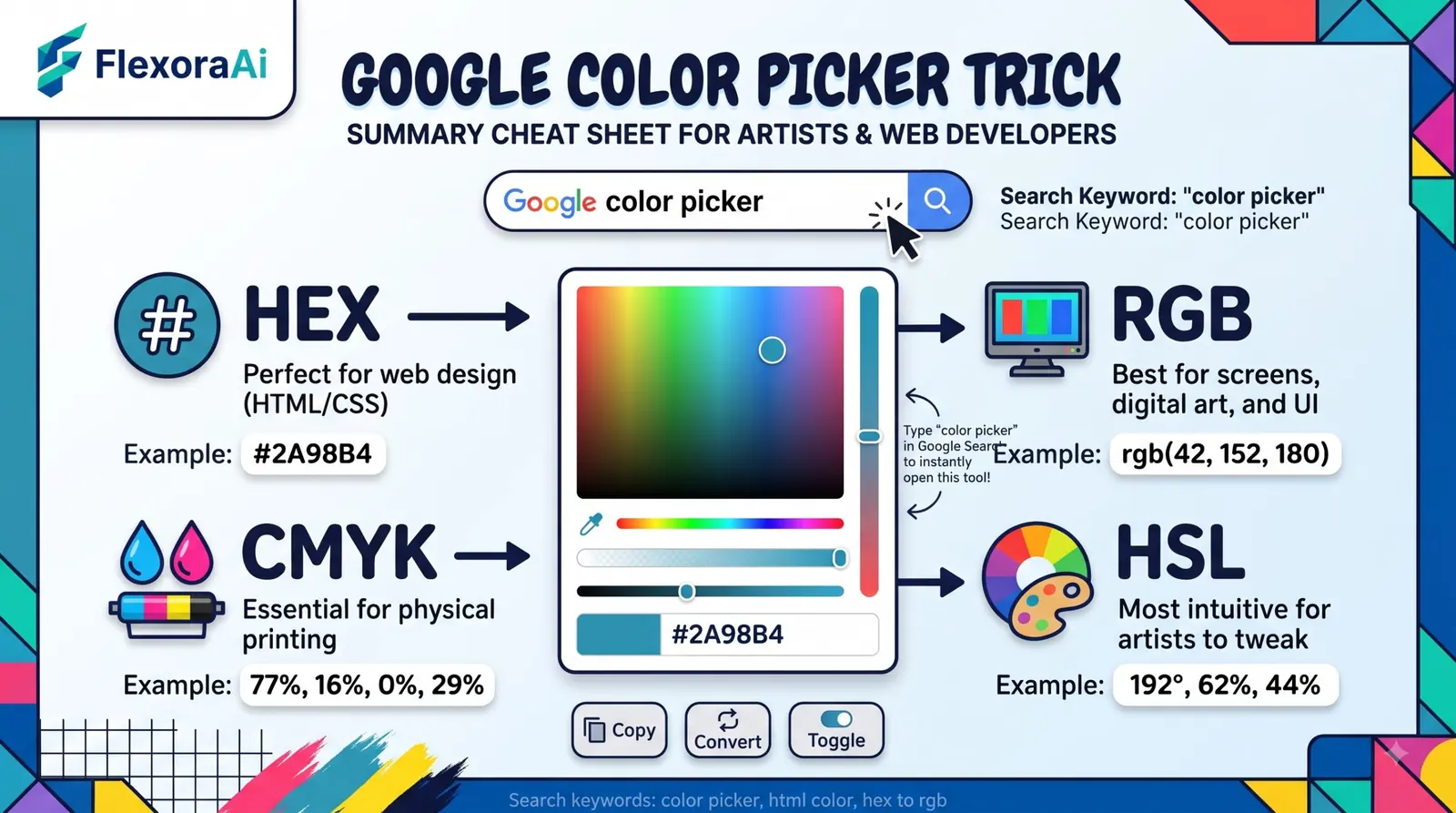
You've found the perfect blue in a photo, and now you need its code. You don't need a design app. Search for “color picker” and Google gives you one, complete with the codes designers use. It's one of the most useful tools in our Google search tricks list, and this guide explains what the numbers mean so you can use them well.
Short answer: Search for color picker on Google. Drag across the spectrum, move the hue slider, and copy the HEX, RGB, CMYK, HSV or HSL value you need. You can also type a code to see its color.
Worth knowing
- The tool converts between HEX, RGB, CMYK, HSV and HSL.
- It's quick for web design, slides and documents.
- Check text contrast before you commit to a color pair.
How to use it
- Search for color picker in Google.
- Move the hue slider to choose a base color.
- Click or drag in the spectrum to adjust shade and brightness.
- Tap the copy button next to the value you need.
What the codes mean
| Format | What it is | Typical use |
|---|---|---|
| HEX | Three numbers in base 16, written after a hash sign | Web pages and CSS |
| RGB | Red, green and blue from 0 to 255 | Screens and code |
| HSL / HSV | Hue, saturation and lightness or value | Intuitive adjustments |
| CMYK | Cyan, magenta, yellow and black | Printing |
A worked example: the bright blue #1E90FF is the same as RGB 30, 144, 255. In HEX each pair is one channel: 1E is 30, 90 is 144 and FF is 255. Once you see that, the codes stop looking like magic.
Google's picker is a good example of a quiet tool that replaces a download, a theme we return to in our complete list of Google Easter eggs.
Check your contrast
Pretty isn't enough. Text must be easy to read against its background. Web accessibility guidelines recommend a contrast ratio of at least 4.5 to 1 for normal text. A pale gray on white often fails, while dark gray or black passes.
- Pick the text color first. Dark text is safest.
- Test the pair. Use a contrast checker once you have two codes.
- Don't rely on color alone. Add labels or icons so color-blind readers aren't left out.
When to use something else
The Google picker is quick, but it isn't a full design tool. It can't sample a color from a photo, and it doesn't save palettes. For those jobs, use your design software's eyedropper. For a quick code, Google is hard to beat.
Tips
- Keep a note of codes. Paste them into a document as you go.
- Use HSL to tweak. Changing lightness gives a lighter or darker shade of the same color.
- Convert for print. Use CMYK values only as a starting point, since screens and printers differ.
For more retro web craft, see our retro Google tricks guide.
Pick a palette the simple way
You don't need many colors. A common rule of thumb is to use one main color for about sixty percent of a design, a second for thirty percent and an accent for ten. The HSL values in Google's picker make this easy: keep the hue, and change the lightness to get a lighter or darker shade of the same color.
- Start with one hue. Pick it with the slider.
- Make two shades. One light and one dark, by changing lightness.
- Add one accent. A color across the wheel stands out well.
- Test your text. Check contrast on every pair.
Designing for color blindness
Roughly one in twelve men has some form of color vision deficiency, and far fewer women do. Red and green are the most common problem pair. If your design uses color to carry meaning, such as red for errors and green for success, add a second signal like an icon or a label. It costs nothing and helps everyone.
Where the codes go
| Where you're working | Use this format |
|---|---|
| A web page or stylesheet | HEX or RGB |
| A slide deck | HEX or RGB |
| A print job | CMYK as a starting point |
| Fine-tuning a shade | HSL |
How we checked this: We used PopSci, Digital Trends and a how-to on non-search features for the tool's features, and the Web Content Accessibility Guidelines for the contrast ratio. Interface details change, so yours may look slightly different. If something here is out of date for you, email ownerflexora.ai@gmail.com and we will fix it.
Your turn: Pick a color you like, copy its HEX and RGB values, and see if you can convert one to the other by hand.
Once the codes make sense, you'll start to see colors as numbers. It's a small skill that makes every design task easier.
More tricks to try
Want a trick that flips things around? The Google flip a table trick is next.
Frequently Asked Questions
For more built-in tools, read PopSci's guide to Google's built-in tools.