🖥️ Google Easter Eggs · Retro Google
Google in 2000
Old Look
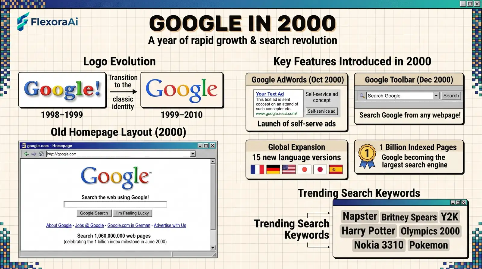
Open google.com, then picture the same page with a soft shadow under the logo and two buttons. That was Google in 2000, and it looks almost like today. Behind that plain page, the company was about to change how the web earned money. Here is a close look at the page, the logo and the year, as part of our retro Google tricks guide.
Short answer: In 2000, Google's homepage was a plain page with the Catull-based logo, a search box and two buttons, Google Search and I'm Feeling Lucky. The logo, designed by Ruth Kedar in 1999, had a drop shadow and remained in use until 2010.
Worth knowing
- The 1999 logo by Ruth Kedar was in use throughout 2000.
- The year brought MentalPlex, Google's first April Fools prank, and the launch of ads in October.
- You can browse snapshots on the Internet Archive.
How the 2000 homepage looked
| Element | In 2000 |
|---|---|
| Logo | Catull-based, with a drop shadow. No exclamation point. |
| Buttons | Google Search and I'm Feeling Lucky. |
| Layout | Plain white page, little text. |
| Footer | Links such as advertising programs and business solutions. |
The 1999 logo replaced the home-made first logo, which had been made by Sergey Brin with GIMP and carried an exclamation point. Ruth Kedar's version dropped the exclamation point and gave the wordmark a cleaner, more professional look.
What else happened in 2000
- April: MentalPlex, Google's first April Fools prank, invited users to project a mental image of what they wanted to find.
- October: Google launched its advertising program, the first step toward its business model.
- The year of the Doodle: special logos, some by Dennis Hwang, began to be a regular feature.
The playful side of Google began early, and many of those early jokes are collected in our complete list of Google Easter eggs.
How to see it for yourself
- Open the Internet Archive's Wayback Machine.
- Enter google.com and choose the year 2000 on the calendar.
- Click a snapshot date with a colored circle.
- Expect missing images and some broken links.
What the 2000 page teaches
The surprising lesson is how little changed. The homepage has stayed minimal for more than twenty years, and the same two buttons survived for a long time. What did change is everything behind the box.
For more ways to compare Google's past and present, see our Google search tricks list.
Why the 1999 logo lasted so long
Ruth Kedar's design swapped the first logo's typeface for Catull and dropped the exclamation point. It then stayed, with only small changes, until May 2010, about a decade. That is why anyone who used the web in the 2000s remembers it so clearly.
A stable logo helped a young company look dependable. It also made the 2010 refresh feel like an event when it came.
The year in numbers and firsts
- April: MentalPlex, Google's first April Fools prank.
- Mid-2000: Google announced that its index had passed one billion web pages.
- 2000: Yahoo began using Google to power its search results, according to reports of the time.
- October: Google launched its advertising program, with text-only ads to keep the page uncluttered.
- Holidays: Valentine's Day and Easter both got Doodles in 2000.
Taken together, those items show a company still small enough to prank its users and large enough to reshape how search was funded.
How to read a 2000 snapshot
- Check the date stamp at the top of the Wayback Machine page.
- Expect missing images and some broken links.
- Look at the footer, where the product links change most between years.
- Compare the buttons with today's page and note what survived.
How we checked this: We used Wikipedia's Google logo article for the logo history, coverage of MentalPlex for the prank, and Search Engine Land's history for the ads program. Archived pages vary, so what you see may not match our description exactly. If something here is out of date for you, email ownerflexora.ai@gmail.com and we will fix it.
Your turn: Open the 2000 snapshot, then today's Google. Write down three things that are the same and three that are different.
The page you open today is, in spirit, the page of 2000: a logo, a box and a promise. What changed is the machinery behind it. Open a 2000 snapshot next to today's Google and look for what stayed the same. That list is surprisingly long.
Where to go next
Want to see how things moved on five years later? Our guide to the Google in 2005 old look is next.
Frequently Asked Questions
For the full logo history, see Wikipedia's Google logo article.