🎮 Google Easter Eggs · Retro Google
Google in 2010
Old Look
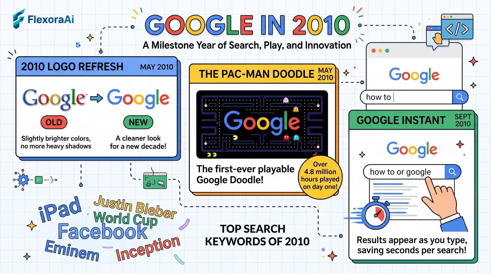
In May 2010, almost nobody noticed that the Google logo had changed. Two weeks later, everybody noticed that it had turned into Pac-Man. Together those two moments mark the end of Google's first look, and they're the reason 2010 deserves a place in our retro Google tricks guide.
Short answer: On May 6, 2010 Google made the first change to its logo in about a decade: brighter colors, a reduced shadow, and the second o shifted from yellowish to orange. On May 21 it released its first playable Doodle, Pac-Man.
Worth knowing
- The 2010 refresh was subtle but it ended the 1999 look.
- The Pac-Man Doodle came just a few weeks later.
- A flat logo followed in 2013 and Product Sans in 2015.
What changed in the logo
| Detail | Before (1999) | After (May 2010) |
|---|---|---|
| Colors | Original tones | Brighter |
| Shadow | Strong drop shadow | Reduced |
| Second o | Yellowish | Orange |
It was a small change, and most people wouldn't have noticed it side by side. But it was the first alteration since Ruth Kedar's 1999 design, and it marked the start of a run of changes: a flat look in 2013 and a new typeface, Product Sans, in 2015.
The Pac-Man Doodle
On May 21, 2010 Google replaced its logo with a playable Pac-Man maze for the game's 30th anniversary. It was the first Google Doodle that you could play, and the I'm Feeling Lucky button became an Insert Coin button. Millions of people played it in its first days, and it became a permanent page afterwards.
It's one of the most beloved entries in our complete list of Google Easter eggs.
How the three eras compare
| Year | Logo | Homepage mood |
|---|---|---|
| 2000 | 1999 Catull logo with shadow | Plain, text-first |
| 2005 | Same logo | Plain, with more products behind it |
| 2010 | Brighter, shadow reduced | Plain, with playable Doodles starting |
How to see the 2010 homepage
- Open the Internet Archive's Wayback Machine.
- Enter google.com and select 2010.
- Pick a snapshot from May or later to see the new logo.
- Compare it with a 2005 snapshot, if you have one.
What to look for
- The shadow. It is much softer than before.
- The orange o. A small color change, easy to spot.
- Doodles. Look for snapshots around May 21 to see Pac-Man.
For more history through the lens of tricks, see our Google search tricks list.
The Keystroke logo and Google Instant
In September 2010, just before Google Instant arrived, Google released a Doodle known as the Keystroke logo. It began as a gray, colorless logo that lit up in the standard Google colors as you typed the first letters of a search. Instant itself showed results while you typed, so the logo was a way of showing the idea.
It is a small detail, but it shows how quickly Google's playful side was growing. A few months earlier it had made a playable game from its logo. Now it was turning the logo into a demonstration of a new feature.
From 2010 to today: the logo's last sixteen years
| Date | Change |
|---|---|
| May 6, 2010 | Brighter colors, reduced shadow, orange second o. |
| September 19, 2013 | A flat logo with no shadow. |
| September 1, 2015 | The Product Sans typeface. |
| May 2025 | Reports of an updated "G" icon, the first in about ten years. |
| May 19, 2026 | A slight update with a modified Google Sans and brighter hues. |
What the changes have in common
Each step simplified the logo and made it work better on screens. The shadow went first, then the serif typeface, then the colors were refined. The 2010 refresh was the first move in a long, steady push toward a flatter, lighter brand.
How we checked this: We used Wikipedia's Google logo article and logo-history summaries for the 2010 details, and coverage of the Pac-Man Doodle for the date. Archived snapshots may not exist for every day. If something here is out of date for you, email ownerflexora.ai@gmail.com and we will fix it.
Your turn: Find a snapshot from before May 6, 2010 and one from after. Can you spot the differences without a guide?
A shadow, a shade of orange and a game of Pac-Man: that's how Google's first look ended. Find a snapshot from before May 6, 2010 and one from after, then see if you can spot the change without looking at our table. It's harder than it sounds.
Where to go next
Want a tour of the tools for browsing Google's past? Our guide to the Google time machine trick is next.
Frequently Asked Questions
For the full logo history, see Wikipedia's Google logo article.